TL;DR: Over 65% of emails are opened on smartphones today. If your email doesn’t work on mobile, you’re losing the majority of your audience before they read a single line. This article covers 7 concrete elements that determine whether a mobile friendly email actually works: subject line and preheader, single-column layout, fonts, above-the-fold CTA, images, dark mode support, and testing across email clients.
You check email in bed, on the subway, over coffee. Your subscribers do the same. According to HubSpot’s 2025 data, 65% of all emails are opened on mobile devices. Gmail reports that 75% of its users access the app on a phone.
This isn’t a trend you can wait out. It’s the baseline.
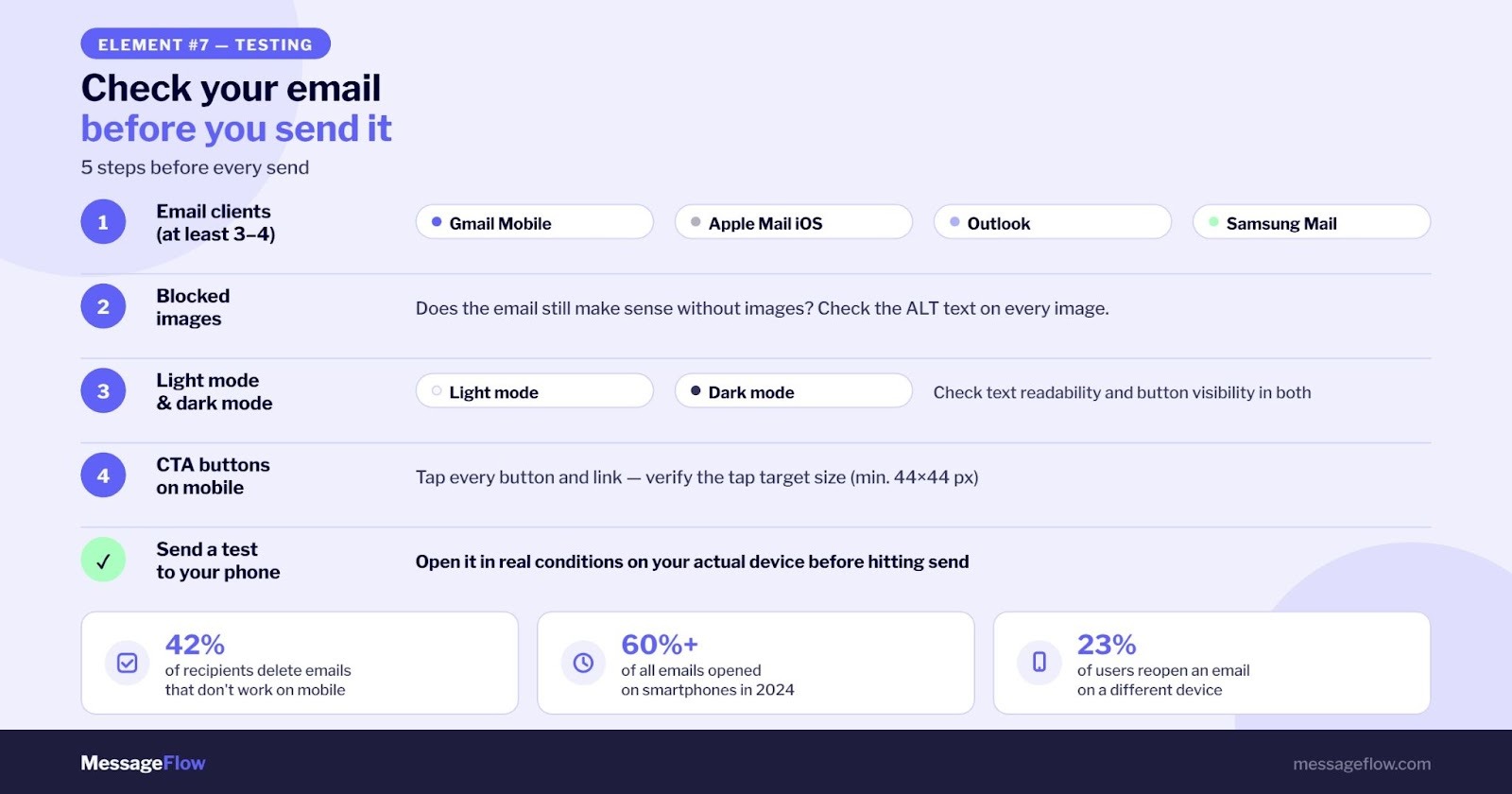
The problem is that emails are designed on laptops and read on 6-inch screens. A campaign that looks perfect on a desktop monitor often breaks on mobile: text too small to read, buttons impossible to tap, layout falling apart. According to OptinMonster, half of all recipients delete emails that don’t render correctly on mobile. Some unsubscribe.
Below are 7 elements that determine whether your mobile friendly email actually works, not just looks good in a desktop preview.
What Does “Mobile Friendly Email” Actually Mean?
A mobile friendly email is one that displays correctly on a smartphone screen without zooming, horizontal scrolling, or guessing where to tap. Technically, this is achieved through responsive design (RWD): an HTML table-based layout that adapts to screen width using CSS media queries.
In practice, it comes down to something simpler: the recipient opens the email, sees readable text, one clear button, and knows what to do. No pinching. No frustration.
One distinction marketers often miss: mobile-friendly and responsive aren’t the same thing. A responsive email is always mobile-friendly, but a mobile-friendly email isn’t necessarily responsive. A responsive email dynamically adjusts its layout, font sizes, and button dimensions based on screen size. Mobile-friendly just means it’s readable on a small screen. For modern email marketing, you want both.
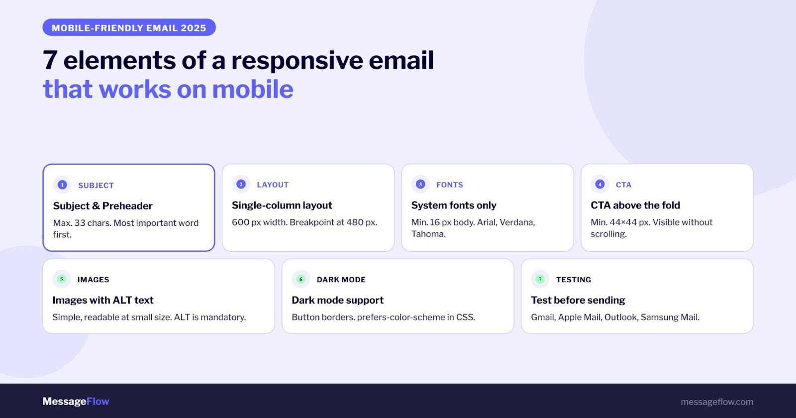
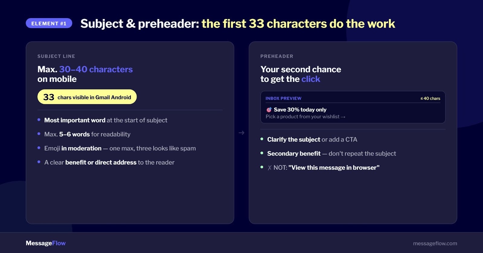
1. Subject Line and Preheader: The First 33 Characters Do the Heavy Lifting
How long should an email subject line be for mobile?
An email subject line for mobile should be no longer than 30-40 characters. Gmail on Android shows roughly 33 characters by default, and bold unread messages take up even more space, making shorter subject lines the safer choice. Desktop inboxes show around 60 characters, so the gap is significant.
The most important word goes first. Someone skimming their inbox reads a few words and decides: open or ignore.
A few rules that hold up in practice:
- Keep it to 5-6 words maximum
- Lead with a specific benefit or a direct question
- Emoji in moderation: one can catch the eye, three look like spam
- Preheader: keep it under 33-40 characters, tied directly to the subject
The preheader is the text visible next to the subject line in the inbox preview. Many brands ignore it or default to “View this message in your browser,” which is wasted real estate. Use it for a secondary benefit, a detail that builds on the subject line, or a soft call to action.
Together, the subject line and preheader are the first impression that drives open rate before anyone sees your content.
2. Single-Column Layout: Less Scrolling, More Conversions
Most people don’t scroll far on a phone. If your CTA shows up after three screens of content, most recipients won’t reach it.
A responsive email on mobile should use a single-column layout. Two columns sometimes work on a tablet, but on a smartphone they frequently collapse unpredictably at 480px or narrower. Multi-column table breakdowns look different across email clients, and the results are often messy.
The technical basics:
- Build your layout on HTML tables (ensures consistent rendering across email clients)
- Optimal email width: 600px
- Use CSS media queries to adapt styles to screen width
- Set your breakpoint at 480px, where the layout shifts from multi-column to single-column
Give your sections room to breathe. On a small screen, tightly packed content is hard to read and increases the chance of accidental taps. White space isn’t wasted space.
How to make it easier? Mobile Design Mode in MessageFlow
Instead of manually writing CSS rules and media queries, the Drag & Drop editor in MessageFlow includes a fully interactive Mobile Design Mode. Click the phone icon in the workspace and every formatting change you make applies exclusively to smartphone screens. This lets you fine-tune:
- Heading font sizes, to prevent awkward line breaks on small screens
- Text alignment, switching from left-aligned to centered
- Row padding, to reduce wasted vertical space
- Element visibility — hiding large decorative images to simplify the layout and speed up loading on mobile connections
Learn more about Mobile Design Mode →
3. Fonts: Readability Over Originality
Which fonts work in mobile emails?
The fonts that work best in mobile emails are system fonts: Arial, Verdana, Tahoma, Times New Roman, Georgia. They’re available on every operating system and every email client. Custom fonts may fail to load in Gmail, Outlook, or Apple Mail and will be replaced by system defaults, breaking your design.
Font size is more important than most designers admit. Too small and recipients have to zoom in, which breaks the entire layout. Standard guidelines:
- Body text: 14px minimum, 16px preferred (noticeably more comfortable on phones)
- Headings: 18-22px
Keep in mind that the same point size looks different in Verdana versus Times New Roman due to differences in x-height. No custom font is safe in email if consistent rendering across all recipients matters to you.
4. Above-the-Fold CTA: Put the Most Important Thing First
Where should the CTA button go in a responsive email?
The CTA button should be visible in the first view on mobile, before any scrolling. On most smartphones, the visible area without scrolling is roughly 300-400px of content. If your main call to action sits below that, a portion of your audience will never reach it.
A few technical details worth getting right:
- Minimum button size: 44 x 44px (aligned with WCAG 2.1 accessibility guidelines)
- On mobile, buttons don’t change color on hover, so they need to look tappable immediately: high contrast, legible text, big enough touch target
- All clickable elements need adequate spacing so recipients don’t tap the wrong link
Keep in mind that many subscribers open email on their phone but complete a purchase later on a desktop. Research shows that 23% of people open emails again on a different device. That’s fine. A consistent experience across devices supports, not hurts, conversion.
5. Images: Simple, Readable, With ALT Text
In responsive emails, images scale automatically. A photo with fine details that reads well at full size will become illegible on a phone.
A few principles for selecting and preparing images:
- Avoid images that rely on small details being visible
- Use solid backgrounds or simple gradients
- Formats: JPG (photos), PNG (graphics with transparency), GIF (animations), WebP (modern alternative with smaller file size)
- Every image must include an ALT attribute with a descriptive label
That last point matters more than it might seem. Several email clients, particularly Outlook and some mobile versions, block image loading by default. If an image doesn’t load, the recipient sees only the ALT text.
Beyond email client behavior, ALT text is a cornerstone of digital accessibility and increasingly a legal requirement. Check our guide on how to keep your communication compliant with the European Accessibility Act (EAA) to make sure your emails meet the upcoming standards.
A useful description:
- “30% off all items in the Sale category, click to shop.”
- A useless one: “image001.jpg.”
Don’t build your entire email structure out of images. An email where all the content lives in one graphic shows a blank message when images are blocked. One more thing: JavaScript doesn’t work in any email client.
6. Dark Mode: The Growing Blind Spot in Email Marketing
How do you handle dark mode in emails?
Dark mode is now the default for a growing share of users. Apple Mail, Gmail on iOS and Android, Outlook on Windows: all of them support dark mode, and each handles it differently. An email designed without dark mode in mind can look perfectly fine in light mode and completely unreadable in dark mode, with invisible text, reversed colors, or disappearing buttons.
Basic safeguards to put in place:
- Avoid white text on transparent backgrounds (in dark mode, the background color may shift, making the text disappear)
- Add visible borders to buttons and interactive elements
- Use color-scheme and prefers-color-scheme in your media queries if you want full control
- Test in both light and dark mode before sending
This is one of the areas that separates polished campaigns from average ones. Most email marketing tools don’t handle this automatically yet.
7. Testing: Check the Email Before You Send It
A campaign that “looks fine in preview” isn’t good enough. Different email clients render HTML and CSS differently. Gmail strips out certain CSS tags. Outlook uses a Word rendering engine that doesn’t support modern web standards. Apple Mail and iOS Mail behave differently from Gmail on Android. According to Litmus, iPhone’s native email app currently holds the largest share of the email client market globally.
Run a technical check first
Before focusing on visual rendering, check the technical health of your message. The free tool Mailchecker.net lets you quickly verify authentication records (SPF, DKIM, DMARC) and run a spam content analysis.
What to check before sending:
- Rendering in at least 3-4 email clients: Gmail mobile, Apple Mail iOS, Outlook, Samsung Mail
- Display with images blocked: does the email make sense without visuals?
- Both light mode and dark mode
- Every button and link on a real phone: verify the tap target size
- A test send to your own phone, checked in real conditions
The Email Preview module in the MessageFlow panel gives you a quick rendering check across the most popular web and desktop environments, including iOS. Use it as a first pass but for full mobile testing, real devices or dedicated testing tools will give you the most reliable results.
Summary
A mobile friendly email is a baseline requirement, not a bonus feature. More than half your subscribers open email on a phone, and if anything breaks, they leave. Subject line under 33 characters, single-column layout, system fonts at 14-16px, CTA above the fold, images with ALT text, dark mode support, and testing across multiple clients: these seven elements are what make an email campaign actually work.
If you want to cut the time it takes to build responsive campaigns, MessageFlow offers ready-made, pre-tested email templates along with audience segmentation and campaign analytics tools, no HTML coding required.
Frequently Asked Questions
A mobile friendly email is an email designed to display correctly on a smartphone or tablet screen. It means readable text without zooming, a single-column layout adapted to a narrow screen, appropriately sized CTA buttons, and images with ALT text. This is achieved through responsive design built on HTML tables and CSS media queries.
An email subject line for mobile should be no longer than 30-40 characters. Gmail on Android shows approximately 33 characters by default. Bold unread messages take up more space, so shorter subject lines are safer. The preheader should be similar in length and connected to the subject line content.
The minimum readable font size in a mobile email is 14px for body text, but 16px is more comfortable for most recipients. Headings should be 18-22px. Use system fonts (Arial, Verdana, Tahoma, Times New Roman) that render correctly in all email clients.
Send a test email and check it in at least 3-4 email clients: Gmail mobile, Apple Mail iOS, Outlook, and Samsung Mail. Check how it looks with images blocked and in dark mode. Tap every button on a real phone to verify the touch target size.
Media queries are CSS rules that let you adjust an email’s appearance based on the recipient’s screen size. They allow the same email to display 14px text on a phone and 16px on a tablet, or switch from a two-column to a single-column layout when the screen width is 480px or smaller.