A thank you page is often the first thing people see after they take an action: subscribe, order, download, or send a message. It looks simple, which is why it’s often neglected. But if this page is vague or poorly structured, it creates doubt (“did it go through?”), repeats (“I’ll submit again”), and unnecessary support traffic.
A good thank you page does the opposite: it confirms the action, sets expectations, and gives the user a clear path if something goes wrong. All this while not trying to turn every moment into a pitch. There’s time and place for everything.
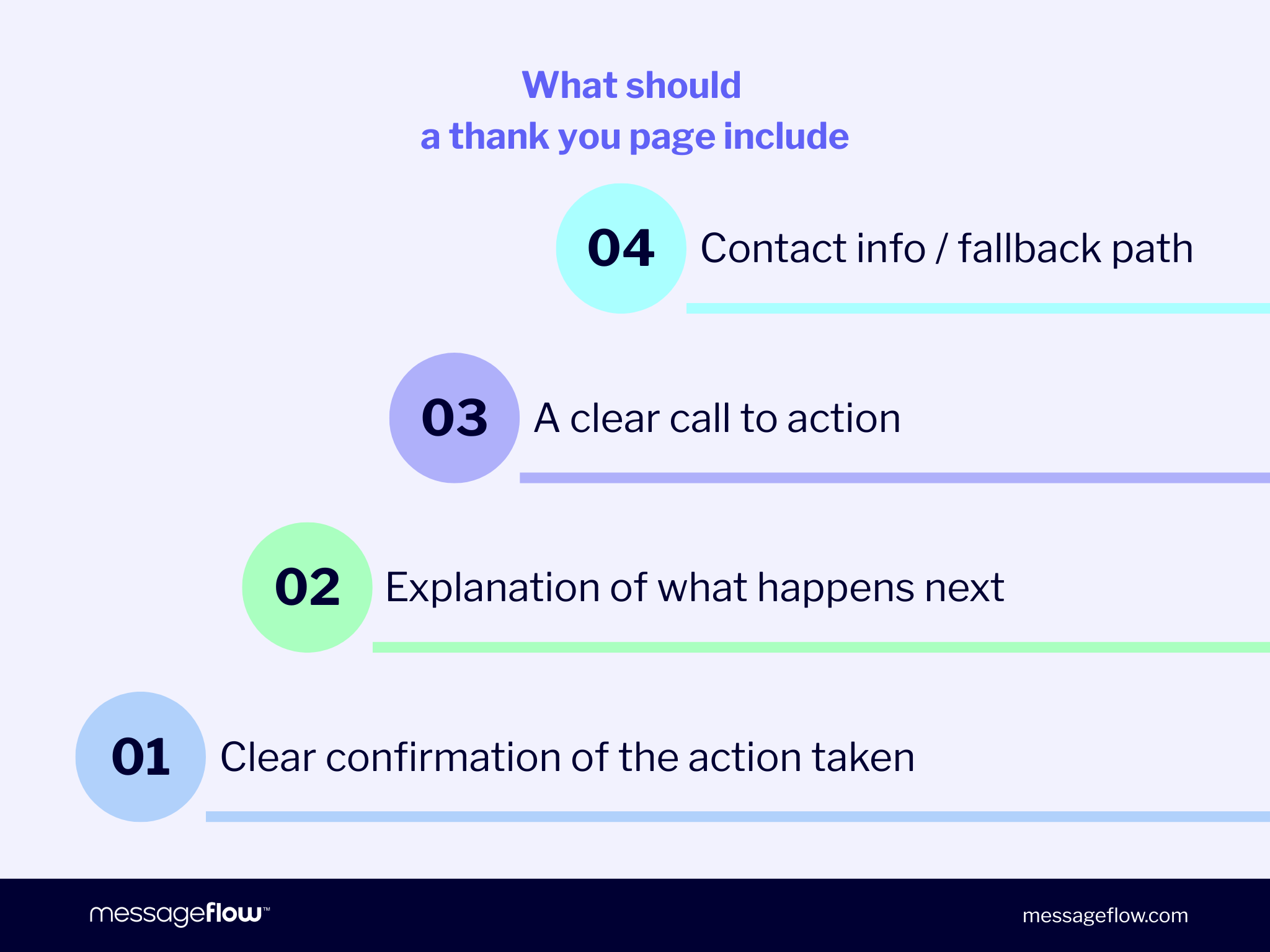
What should a thank you page include?
If you’re wondering what to include on a thank you page, start with one rule: the page shouldn’t try to do multiple unrelated things at the same time. Instead, it should answer two questions fast:
- Did it work?
- What happens next?
Everything listed below exists to support those two answers.
Essential elements:
- Clear confirmation of the action taken
Your headline should close the loop immediately: “Subscription confirmed,” “Order received,” “Message sent,” “Download ready.” - Explanation of what happens next
One or two lines, with real timing when possible: “Check your inbox – the confirmation email should arrive within 5 minutes.”, “We’ll send the next update when your order ships.”, “We’ll reply within 24 business hours.”
- A clear call to action
But only if the next step makes sense. Keep it to one primary action: “Download,” “Add to calendar,” “Back to the shop,” “Manage preferences,” “Visit the help center.” - Contact information / fallback path
A short “If something doesn’t look right…” with a support link or email address. This alone prevents a lot of duplicate submissions.
Additional, optional elements:
Use these only when they support the intent of the moment and don’t distract from confirmation and next steps:
- Recommended content or products (relevant, minimal)
- Social proof (reviews, trust signals)
- Discount or bonus (only if it fits the context and doesn’t feel like a bribe)
- Links to related resources (FAQ, returns, setup guide, order status)
Thank you page examples
Below are practical thank you page examples you can copy and adapt to your specific context. Each one follows the same logic: clear confirmation, a short “what happens next,” and one sensible action when it fits. If you’re building a thank you page template library, these are solid defaults.
Newsletter signup thank you page
Variant A – signup confirmed (no double opt-in)
Headline: Thanks – you’re subscribed
Body: You’ll receive emails at {{email}}
What’s next: Your first email arrives within {{time_window}}.
Primary CTA: Manage preferences → {{preferences_link}}
Fallback: Not you? Unsubscribe here → {{unsubscribe_link}}
Variant B – double opt-in required
Headline: One more step: confirm your email
Body: We sent a confirmation email to {{email}}
What’s next: If it doesn’t arrive within 5 minutes, check the spam / promotions folder.
Primary CTA: Resend confirmation email → {{resend_link}}
Fallback: Still stuck? Contact support → {{support_email}}
Thank you page after purchase
Purchase thank you pages work best when they don’t try to replace the order confirmation email. Confirm the order, set expectations, and point people to the next status update.
Variant A – order received
Headline: Thank you – we’ve received your order
Body: Your order {{order_id}} has been recorded.
What’s next: A confirmation email is on its way to {{email}}. We’ll send the next update when your order ships.
Primary CTA: Continue shopping → {{shop_link}}
Fallback: Questions? Visit support → {{support_link}}
Variant B – payment pending (when this is actually the case)
Headline: Order created – payment confirmation pending
Body: Your order {{order_id}} is saved.
What’s next: Once payment is confirmed, we’ll email you the next steps.
Primary CTA: Check payment status → {{payment_status_link}}
Fallback: Payment stuck? Contact us → {{support_email}}
Thank you page for downloading a resource
If someone downloaded something, the page should make access obvious and predictable. A broken or hidden link turns a high-intent moment into support overhead.
Variant A – download on page
Headline: Your download is ready
Body: {{asset_name}} is ready to download below.
Primary CTA: Download now → {{download_link}}
Extra line: We also emailed the link to {{email}} for easy access later.
Fallback: Link not working? Get help → {{support_link}}
Variant B – link sent by email
Headline: Check your inbox – download link sent
Body: We sent the download link for {{asset_name}} to {{email}}.
What’s next: If it doesn’t arrive within 5 minutes, check the spam / promotions folder.
Primary CTA: Resend download link → {{resend_link}}
Fallback: Still no email? Contact support → {{support_email}}
Contact form thank you page
The core job here is expectation setting. “We’ll get back to you soon” is imprecise and creates follow-ups. A real timeline reduces them.
Variant A – standard SLA
Headline: Thanks – we received your message
Body: We’ll reply within {{sla_time}} (business days).
What’s next: We’ll respond to {{email}}.
Urgent path: If it’s urgent, contact us here: {{urgent_contact}}
Variant B – with reference number & summary
Headline: Message received
Body: Thanks – your request has been logged.
Details: Topic: {{topic}} Reference: {{ticket_id}}
What’s next: We’ll reply within {{sla_time}} to {{email}}.
Primary CTA: Add details to your request → {{ticket_link}}
Best practices for thank you pages
The fastest way to improve a thank you page isn’t necessarily better copy. It’s rather better structure: confirmation, expectations, and a clear fallback.