Reach isn’t just a marketing metric. It’s a responsibility and the foundation of growth.
On 28 June 2025 the European Accessibility Act (EAA) came into effect, marking the deadline by which all European Union member states must ensure that businesses comply with the EAA harmonized accessibility regulations across a wide range of consumer-facing products and services.
The EAA concerns companies offering digital products and services in sectors such as consumer electronics, online retail and ecommerce, digital banking, online media, transport services, and business communication channels. Whether you’re in one of the EU member states or simply do business there, this directive holds you accountable.
And for good reason too. Nearly half of consumers across generations interact with online banking daily, while only 12% of Gen Z open accounts at physical branches. And this is just one of many niches undergoing significant digital transformation.
Similar shifts are happening across industries, leading to ways in which people engage with brands change. As a result, making digital experiences more accessible becomes not merely a good practice, but now also a legal requirement and perhaps even a cultural shift.
Your European Accessibility Act compliance guide to cross-channel communication
The European Accessibility Act introduces consistency and clarity across the EU, ensuring that digital services are inclusive by design.
What do accessibility rules mean for your business?
Is your digital communication strategy ready to meet EAA standards?
And how do you ensure the accessibility of your messaging at scale?
These are all valid questions but rest easy, we’re here to offer practical tips, tools, and takeaways to help you design accessible communication, especially if you’re investing in cross-channel and omnichannel strategies, where customer touchpoints span multiple platforms.
Here’s what you need to know and why embracing accessibility now is a smart move for both your audience and your brand.
What is digital accessibility in communication and why does it matter?
Digital-first is the modern day’ mantra. Regardless of the industry you’re in, your audience likely includes individuals with diverse physical, cognitive, and sensory needs. To reach and serve them effectively, your communication must be designed with accessibility already baked in.
Common accessibility is about more than just compliance
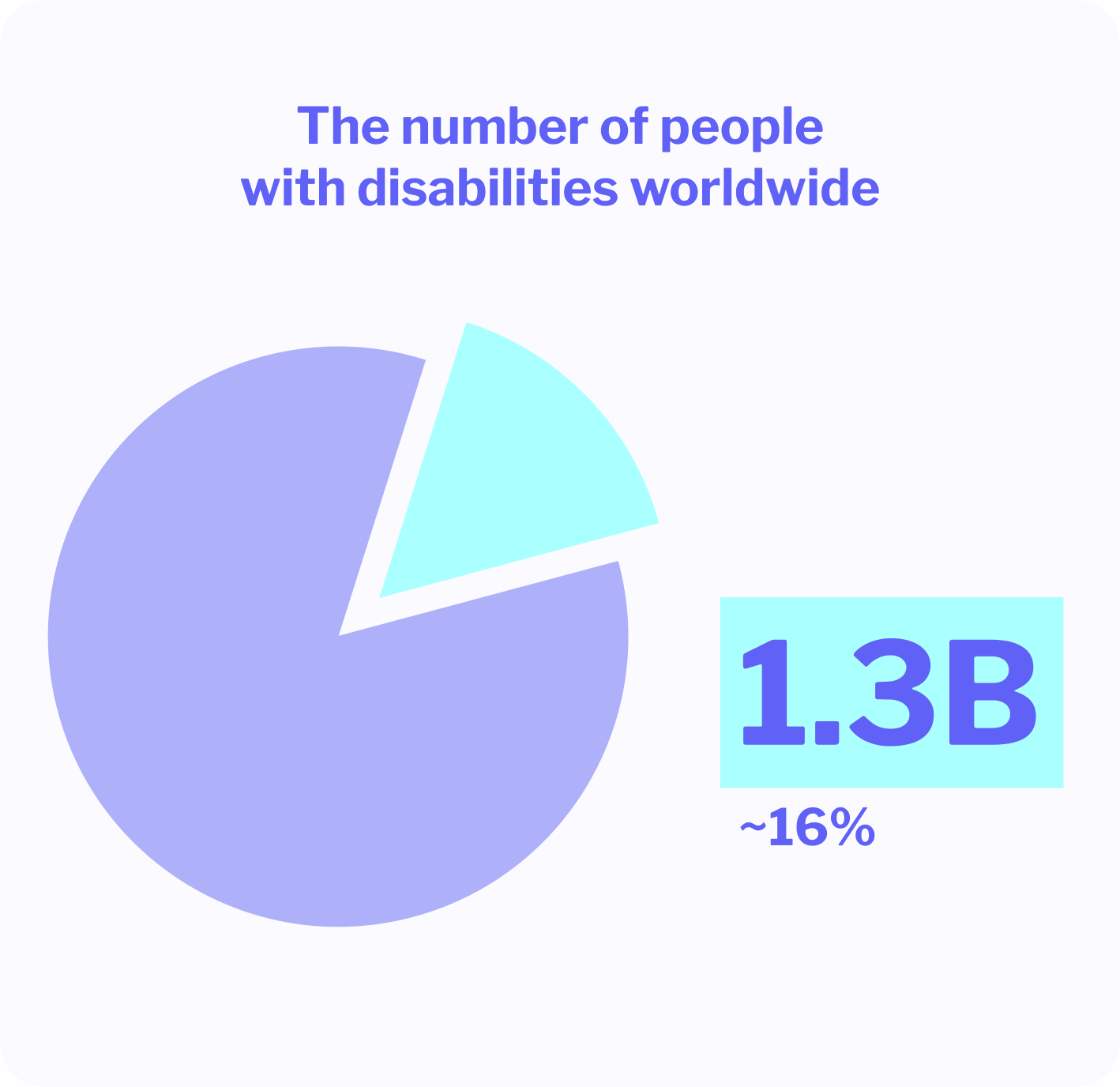
As per the World Health Organization, around 1.3 billion people worldwide live with some form of disability. Among them, many experience visual impairments, motor disabilities, cognitive differences, or neurological conditions all of which can affect how they access and interact with digital content.
The number of people living with disabilities worldwide.
When your messaging in its various forms and channels isn’t designed inclusively, you risk excluding a significant portion of your audience. Meeting accessibility legislation is one thing but what’s more important is creating a better user experience for everyone and empowering more people to interact with your brand on equal terms.
💡 Accessible communication is legible, readable, and actionable for a wide spectrum of people, by default, not exception.
What inclusive digital communication requires
Accessible messaging is built on two core principles:
Compatibility with assistive technologies – this includes screen readers, keyboard navigation, and alternative input devices.
Adherence to inclusive design best practices – making content usable and understandable regardless of user’s ability.
For digital communication specifically, this means accounting for individuals who may have:
Visual impairments – including blindness, low vision, and color blindness (daltonism).
Motor disabilities – that require adaptive devices such as switch controls or specialized keyboards.
Cognitive disabilities – such as dyslexia, ADHD, or processing disorders.
Neurological conditions – including epilepsy, which can be triggered by flashing or flickering visuals.
Properly implemented inclusive communication serves everyone involved. It eliminates barriers, fosters trust, and opens up your brand to a wider audience while aligning with the goals of the European Accessibility Act.
How to make your cross-channel communication break accessibility barriers
The world around us offers no shortage of stimuli and multimedia experiences – a trend that’s likely only going to continue. This translates to omnichannel and cross-channel communication strategies becoming the default approach in many niches.
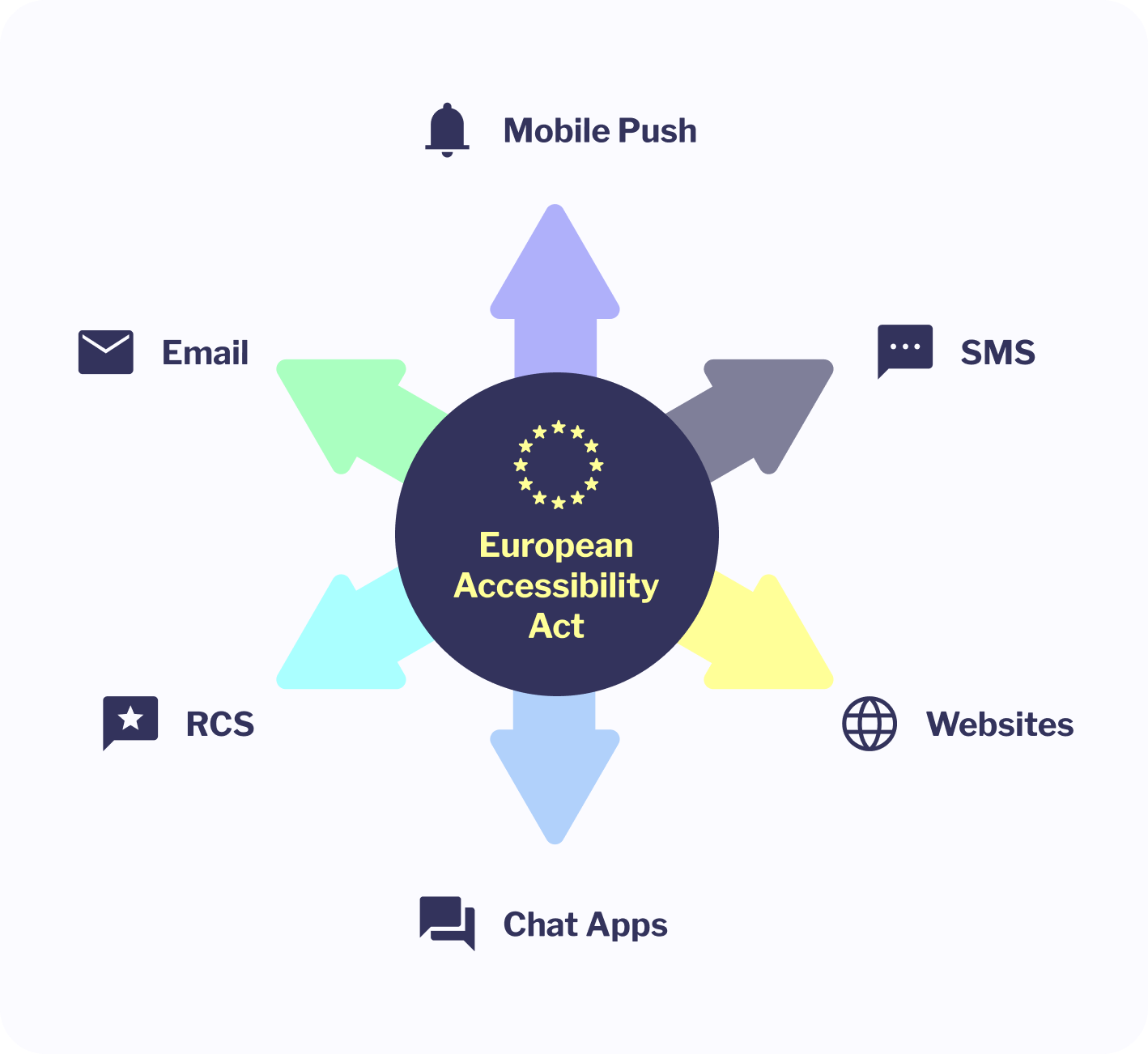
For businesses, ensuring accessibility across a variety of customer touchpoints thus becomes both a challenge and a responsibility. The European Accessibility Act doesn’t just affect some of the most obvious ones like websites or apps. It also has clear implications for digital communication across email, SMS, mobile push, RCS, chat apps, websites and mobile applications.
Impact of the European Accessibility Act on digital communication.
The foundation for accessible digital communication is the Web Content Accessibility Guidelines (WCAG), currently at version 2.1 Level AA. It’s still referenced by the EAA as the essential standard to follow. These guidelines help ensure that content is perceivable, operable, understandable, and robust for users of all abilities.
Coming up is a breakdown of practical do’s and don’ts for a number of specific and crucial messaging channels. It’ll help you keep your communication inclusive, compliant, and effective. Let’s go over it.
Email accessibility
Email remains one of the most versatile and widely used communication channels across the board. It’s highly likely you’ve already been either on the sending or receiving end of it today. In the marketing context, the overall design of your message is important but to align with the European Accessibility Act and serve all recipients effectively, you need to go beyond it.
That said, close to 100% of emails surveyed by the Email Markup Consortium appeared to suffer from “serious or critical accessibility issues”. If EAA requirements aren’t enough for you to address them, consider that the necessary improvements will also contribute to higher open and click-through rates, reduce bounce, and enhance inbox placement.
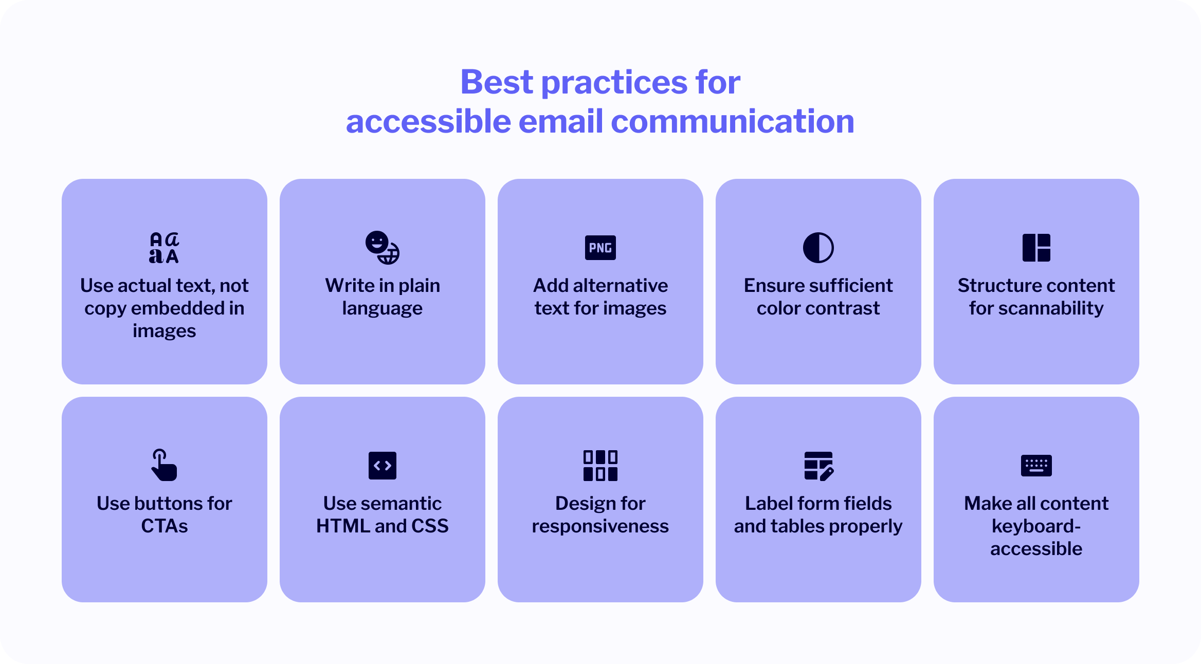
✅ Best practices for accessible email communication
Use actual text, not copy embedded in images Crucial content should always be in selectable, readable text, not stamped into images. This allows screen readers to process it and users to adjust font size if needed.
Write in plain language Keep sentences concise, avoid jargon, and structure content to be understandable at a glance, without dumbing down the message.
Add alternative text for images Provide clear, descriptive alt text properties for all graphics so that screen readers can convey their meaning accurately to users who can’t see them. Keep alt text concise (≤ 125 chars), focused on the image’s purpose, not aesthetics. Use null alt (””) for decorative images, and add longer captions for detailed charts or diagrams.
Ensure sufficient color contrast Avoid low-contrast combinations (e.g., yellow on white, red on black). Use accessible contrast ratios and lean on white space to enhance readability.
Structure content for scannability Break paragraphs into short blocks. Use left-aligned text for sections longer than three lines. Use bold sparingly only to emphasize key points.
Use buttons for CTAs Replace vague links like “click here” with clear, descriptive buttons (e.g., “Explore pricing” or “See webinar schedule”). This improves both visibility and navigation.
Use semantic HTML and CSS Stick to web standards – structural HTML for layout and CSS for styling. Avoid relying on tables for design unless they’re properly labeled.
Design for responsiveness Accessible emails should display equally well on all devices. Use responsive design to ensure legibility and navigability across screen sizes. Use ≥ 14 px font on desktop (≥ 16 px on mobile) and 1.5 × line-height for better legibility and screen-reader compatibility.
Label form fields and tables properly If you’re collecting data or presenting tables, ensure everything is labeled semantically so assistive tech can read it in the right order.
Make all content keyboard-accessible Users should be able to navigate, activate links, and interact with forms using only the keyboard.
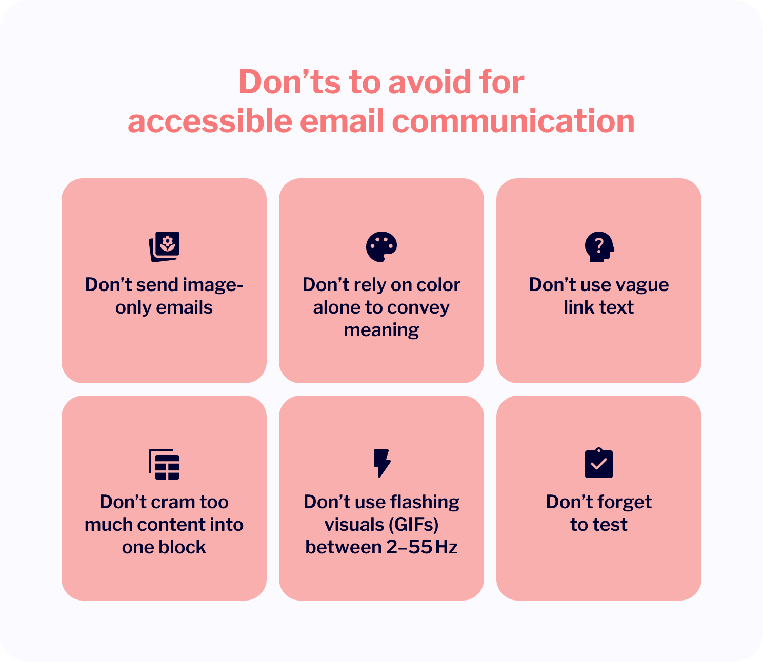
❌ Don’ts to avoid
Don’t send image-only emails Screen readers can’t interpret text embedded in images, and mobile users may have image loading disabled by default. If your entire message is an image, it may never be seen.
Don’t rely on color alone to convey meaning Use text labels and iconography to support color coding (e.g., success/failure states), especially for users with color blindness.
Don’t use vague link text “Click here” or “Read more” without context is unclear to screen reader users. Always make the anchor text descriptive.
Don’t cram too much content into one block Long, unbroken paragraphs reduce comprehension and readability, especially for users with dyslexia, ADHD, or cognitive impairments.
Don’t use flashing visuals (GIFs) between 2–55 Hz These can trigger seizures. Instead, provide static alternatives or warn users in advance.
Don’t forget to test Assumptions about readability and layout can fall flat on real devices or assistive technologies. Test regularly across environments.
Purpose: Evaluates HTML emails for accessibility issues.
Key features: Checks for missing alt text, improper heading structures, and language attributes. Provides actionable suggestions to enhance email accessibility.
Ideal for: Email developers and marketers looking for a straightforward tool to assess and improve email accessibility.
Purpose: Assesses color contrast between text and background to ensure readability.
Key features: Calculates contrast ratios and indicates accessibility compliance with WCAG 2.1 standards. Offers real-time feedback for color adjustments.
Ideal for: Designers and developers aiming to ensure text visibility for users with visual impairments.
Purpose: Simulates how images and designs appear to individuals with various types of color vision deficiencies.
Key features: Allows users to upload images and view them through different color blindness filters. Helps identify potential issues in color-dependent information.
Ideal for: Designers ensuring that visual content is distinguishable for color-blind users.
Purpose: Comprehensive email testing platform with accessibility checks.
Key features: Previews emails across various devices and email clients. Includes tools to test for screen reader compatibility and color contrast. Identifies missing alt text and improper heading structures.
Ideal for: Email marketers and developers seeking an all-in-one testing solution.
💡 For an even more comprehensive discussion of the channel, take a look at this Email Accessibility Guide.
SMS accessibility
SMS is hard to beat when it comes to direct reach and reliability. That said, its character limitations and lack of rich formatting require thoughtful planning to ensure your messages are clear, inclusive, and usable by everyone.
What’s especially important in the context of the European Accessibility Act are links to external content that may trigger interactive journeys.
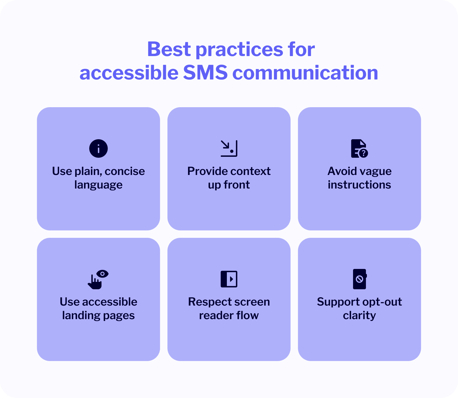
✅ Best practices for accessible SMS communication
Use plain, concise language SMS should be short by nature. Use everyday, direct language that’s easy to understand across demographics.
Provide context up front Make the purpose of your message immediately clear in the first few words. This is especially helpful for screen reader users and people skimming notifications.
Avoid vague instructions Phrases like “Click here” or “Visit the website” are unhelpful on their own. Make sure any links include context: e.g., “Track your order: [shortlink]”.
Use accessible landing pages If your SMS contains a link, the destination page must meet WCAG 2.1 accessibility standards (e.g., screen reader compatibility, proper contrast, mobile responsiveness).
Respect screen reader flow Avoid using special characters or emoji as substitutes for important words, as they can create confusion for assistive tech distorting the message.
Support opt-out clarity Include an easy and clearly labeled opt-out option (e.g., “Reply STOP to unsubscribe”) for users relying on text-only interfaces.
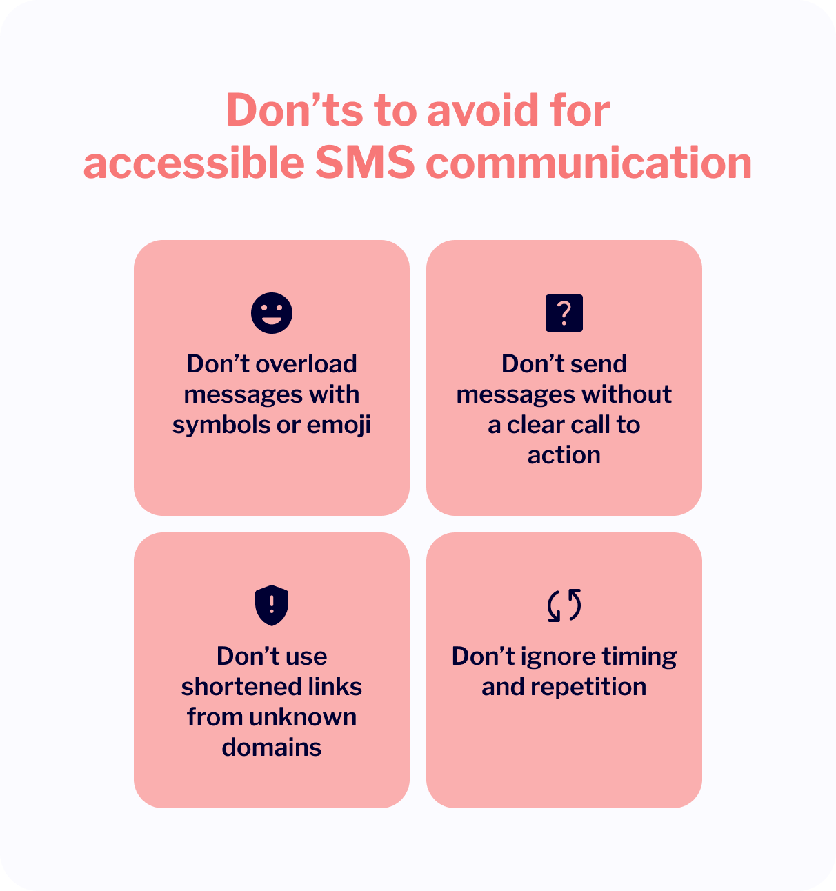
❌ Don’ts to avoid
Don’t overload messages with symbols or emoji Excessive symbols or decorative emoji can disrupt how screen readers interpret messages. They may also distract or confuse users with cognitive impairments.
Don’t send messages without a clear call to action Even in short form, your message should guide the user. Don’t leave them guessing what to do next.
Don’t use shortened links from unknown domains Always use trusted, branded shortlinks whenever possible. Some users, especially those with visual or cognitive limitations, may hesitate to click links they don’t recognize.
Don’t ignore timing and repetition Avoid message clutter or late-night sends, which can be disruptive, especially for recipients who rely on voice alerts or assistive tech.
Practical focus for SMS
Rich-format channels offer more engagement opportunities but at the same time can be not as inclusive as SMS, which is highly accessible by design. It’s basically just plain text, universally supported, and free from layout modifications or color barriers.
This, however, puts the focus almost entirely on clear, inclusive writing because there’s not much in terms of dedicated testing tools available.
To sum it up, aim to use plain language, provide context early, and avoid vague phrasing. If your SMS links to external content, make sure the destination meets accessibility standards, as that’s where assistive technologies come into play. You may want to also consider testing how your messages are read aloud on screen readers before you launch a live campaign.
RCS accessibility
RCS has already been noticed and adopted by brands to a degree, helping them build mobile messaging experiences of the kind we haven’t seen before. Features like rich cards, images, action buttons, and carousels, offering a near app-like experience within the native messaging app, are all super exciting. But for some they may not be fully available.
While RCS is a powerful channel for customer engagement, the messages it carries must be intentionally designed to be accessible for users with visual, motor, and cognitive impairments.
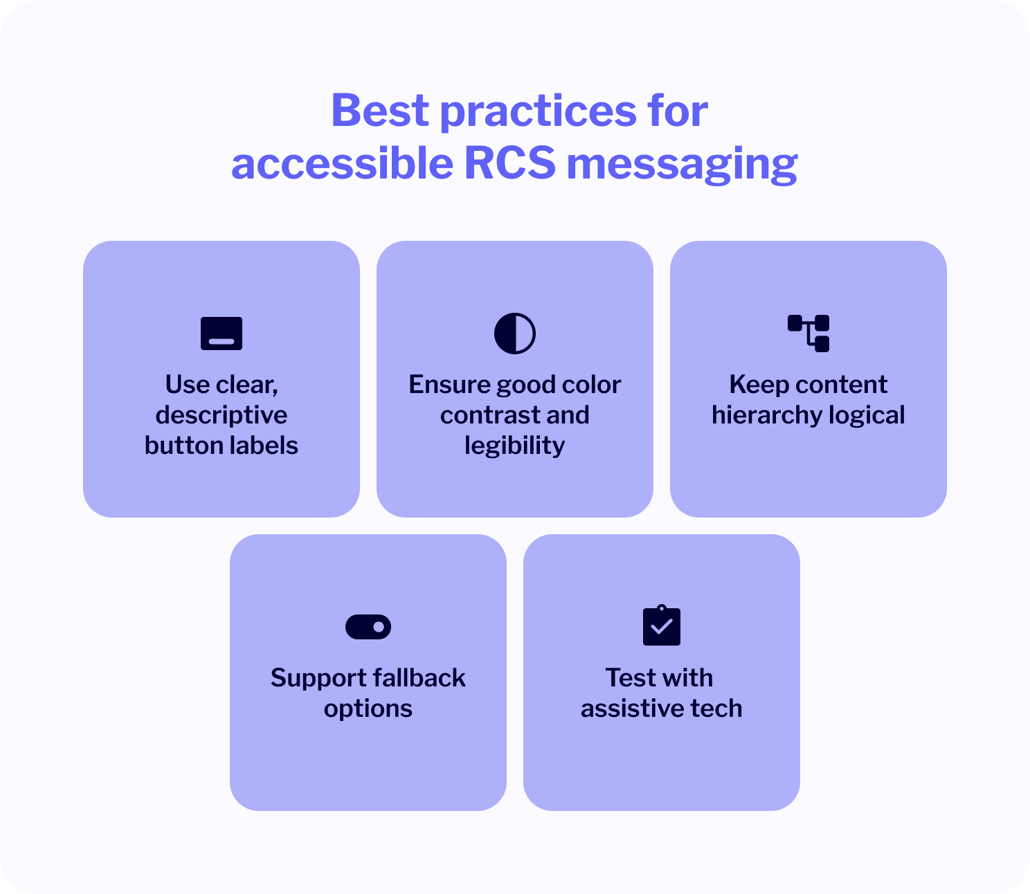
✅ Best practices for accessible RCS messaging
Use clear, descriptive button labels Buttons should say exactly what they do: “View order,” “Reschedule appointment,” “Track package”, not just “OK” or “Click.”
Ensure good color contrast and legibility Text on cards, buttons, or colored backgrounds must have adequate contrast per WCAG guidelines. Avoid color-only cues for conveying meaning.
Keep content hierarchy logical Use short headers, bullets, and clear visual structure to help users navigate multi-part messages (like carousels) more easily.
Support fallback options Ensure your RCS flows switch easily to accessible SMS or web-based content for users whose devices or networks don’t support RCS.
Test with assistive tech Simulate how RCS messages are read by screen readers or navigated using alternative input to identify usability gaps.
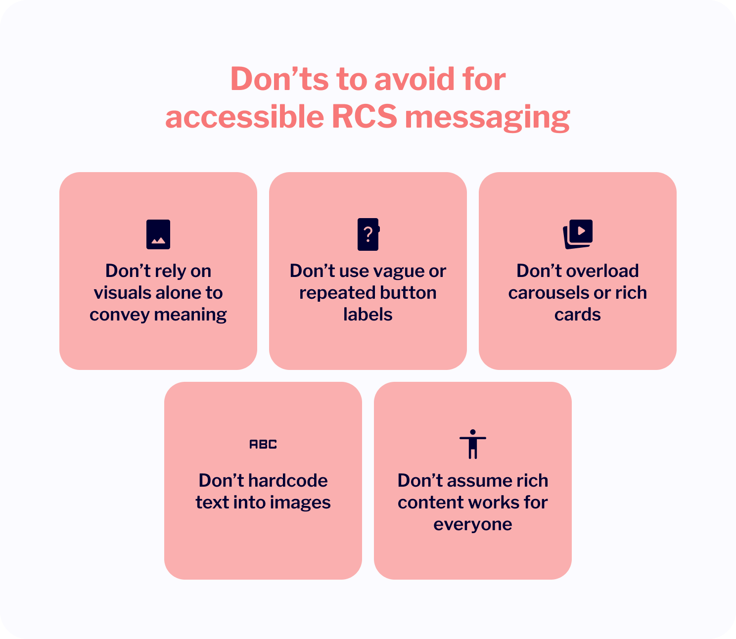
❌ Don’ts to avoid
Don’t rely on visuals alone to convey meaning Always pair images, icons, or color indicators with explanatory text for users who are blind or colorblind.
Don’t use vague or repeated button labels Avoid “Next”/“Next” or “More info”/“More info” button pairs. Screen readers won’t distinguish between them. Use unique, descriptive labels instead.
Don’t overload carousels or rich cards Overly long sequences or cluttered layouts can overwhelm users with cognitive disabilities. Keep it focused and digestible.
Don’t hardcode text into images Any important information embedded in an image (e.g., discount codes, instructions) should be duplicated in live text.
Don’t assume rich content works for everyone Some users will view RCS as fallback SMS or in limited-capability clients. Always provide clear, concise core information regardless of format.
Tools that may help
Google’s RCS Business Messaging test device setup
Google provides a framework for testing RCS Business Messaging (RBM) agents by allowing developers to designate test devices. This allows you to simulate realistic user interactions and assess how a message is rendering on actual devices. While admittedly this isn’t an accessibility testing tool per se, it allows for manual verification of the general accessibility features, including screen reader app compatibility.
General mobile accessibility testing tools
Tools like Google’s Accessibility Scanner for Android and Apple’s Accessibility Inspector for iOS can be employed to assess the accessibility of mobile applications, including messaging apps that support RCS. These tools can help you identify issues such as insufficient contrast, small touch targets, and missing content descriptions, which are relevant to RCS message accessibility.
Mobile push accessibility
Mobile push notifications, due to their vanishing nature, are frequently used to deliver time-sensitive updates such as transaction alerts, shipping changes, quick reminders of all sorts, or flash sales. But because of their brief, yet potentially rich format, accessibility requires special attention.
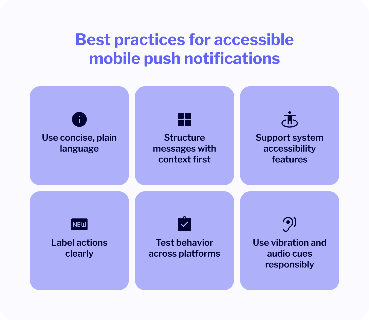
✅ Best practices for accessible mobile push notifications
Use concise, plain language Keep notifications short and to the point. Avoid technical language or unclear references. Users should immediately understand what the notification is about.
Structure messages with context first Lead with the most important info. This helps users who rely on screen readers or voice alerts get the gist without needing to open the full app.
Support system accessibility features Make sure your mobile app is compatible with screen readers, dynamic text resizing, and high-contrast display modes.
Label actions clearly If your push includes quick reply buttons (e.g., “Confirm,” “Reschedule,” “Track”), label them clearly with unique, actionable verbs.
Test behavior across platforms Push notifications can behave differently on iOS and Android. Test for screen reader compatibility, tap targets, and how messages are read aloud.
Use vibration and audio cues responsibly Notifications should respect user settings and not use disruptive or inaccessible alert patterns, especially for users with sensory sensitivities.
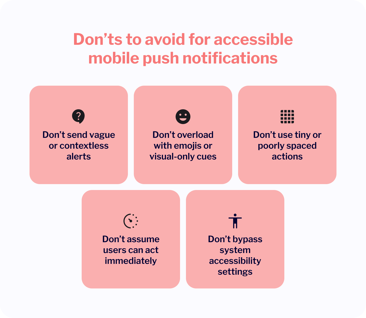
❌ Don’ts to avoid
Don’t send vague or contextless alerts Notifications like “Update available” or “Don’t miss out” offer little real value. For accessibility and UX, include meaningful details like “Update your address for tomorrow’s delivery.”
Don’t overload with emojis or visual-only cues Some users rely solely on text or screen readers. Emojis may not render well, and color-based indicators (e.g., red = urgent) need text to clarify meaning.
Don’t use tiny or poorly spaced actions Ensure that tappable areas (like dismiss or confirm buttons) are large enough for users with limited dexterity or motor impairments.
Don’t assume users can act immediately Some users may not see or be able to respond to a push right away. Include fallback communication (e.g., email or in-app message) if the action is critical.
Don’t bypass system accessibility settings Avoid using custom notification frameworks that ignore OS-level accessibility settings like font scaling or dark mode.
Practical focus for mobile push notifications
Dedicated accessibility testing tools for mobile push notifications are limited. However, since these messages are delivered through mobile applications, general mobile app accessibility testing tools can be used to test whether the communication you send is inclusive and accessible. With their help, you can assess aspects like screen reader compatibility, touch target sizes, and color contrast, which are essential elements comprising push notifications.
Similarly to RCS, solutions like Accessibility Inspector and Accessibility Scanner can help you evaluate how pushes are presented and interacted with on iOS and Android devices, respectively. You can also turn to automated testing tools such as Axe DevTools Mobile to identify accessibility issues within your app’s UI components, including those related to push notifications.
Accessibility testing: Not one size fits all
As you may have noticed, accessibility testing isn’t uniform across digital communication channels. Some, like email, are highly standardized and easy to audit. Others, especially the media-rich mobile ones, rely more on careful content design and device-level behavior.
Here are a number of key takeaways to consider:
Email has the most extensive ecosystem of dedicated accessibility tools, covering everything from contrast to screen reader optimization.
SMS, due to its simplicity, is easily accessible by default. That said, it depends heavily on plain, clear writing and usable link destinations.
RCS and mobile push don’t yet have mature, channel-specific testing tools. Instead, their accessibility depends on app-level behavior, thoughtful design, and manual testing involving screen readers and mobile accessibility tools.
The right approach depends on the channel. Knowing what to test and how is part of building inclusive, EAA-compliant communication at scale, especially in cross-channel in omnichannel strategies.
How EAA applies to CPaaS providers like MessageFlow?
While the European Accessibility Act predominantly affects B2C companies, it also touches CPaaS providers like MessageFlow by association.
This is so because our platform is used to create and deliver messages in multiple channels that reach your target customers. Therefore, we’re committed not only to providing the right tools but also to sharing the know-how needed to use them effectively in the context of digital communication accessibility. We have built our platform to make sure you can meet your obligations with confidence.
How does MessageFlow prioritise accessibility?
There’s a number of ways our platform allows you to create accessible messaging taking into consideration different individual needs:
All images you include in your emails can be tagged with the ‘alt’ attribute to help assistive technology understand their contents.
There’s a number of clean, sans-serif fonts available with the option to set custom size to help people with visual impairments.
There’s a dedicated Mobile Design Mode available that lets you build with mobile-first approach in mind. It allows you to customize the properties of the sections making up your creative in more detail and see the results right away.
There’s also a mobile preview feature to help you assess how well your creative will display on smaller screens, as well as the option to turn off some of the layout elements to improve the experience.
Importantly, MessageFlow is a cross-channel communication platform, which means you can employ different channels to convey your core message, making it more inclusive.
Use email with alt text and semantic HTML for users with visual impairments.
Use SMS for users without smartphones or screen readers.
Use push notifications with simple, time-sensitive alerts for users with cognitive or attention limitations.
Use RCS or Viber for rich messages that help people who benefit from visuals or quick-reply buttons.
💡 An interesting strategy for you to consider may be to start collecting information on the customer’s preferred channel of communication at the time of entering their details into the database. Individuals who signal their disability can then be added to a relevant group using the Segments feature and receive future communication via a medium that best suits them.
In essence, MessageFlow aligns with the European Accessibility Act requirements by:
Enabling accessibility-compliant communication at scale. Our platform plays a crucial role in empowering clients to meet their legal obligations in terms of running inclusive digital communication.
Offering templates and message builders that are designed with accessibility in mind (alt text support, responsive layout, screen reader-friendly structure). Built-in tools that support accessible output, as well as a vast library of professionally designed email templates that are both aesthetically pleasing and technically sound.
Supporting multichannel strategies to help you reach audiences with varying accessibility needs. Our channel flexibility is a tool for inclusion in itself, allowing you to build truly nondiscriminatory messaging flows.
Being a partner in your compliance journey, not just a delivery tool. Creating accessible communication is a shared responsibility. That’s why we stand as a strategic enabler, not a passive infrastructure provider.
💡 While MessageFlow provides the technology and knowledge to make this process simple, you, as the sender, are ultimately responsible for the content you create and how you use these tools. Our role is to empower you to do this correctly and confidently, ensuring your messages are both compliant and effective.
Get ready for the European Accessibility Act 2025
Inclusive communication and EAA compliance aren’t to be thought of as a burden but an opportunity. This codification of fair and reasonable rules goes beyond being a legal milestone. It’s more of a broader shift in mindset: toward designing digital experiences that work for everyone, from the start.
Embracing accessibility requirements makes sense on multiple levels. Your brand demonstrates respect, responsibility, and trust – a set of values that customers expect. Yes, implementing accessibility is required, but what awaits on the other end are stronger relationships and ensuring the message truly reaches every member of your audience.
At MessageFlow, we’re fully aligned with the requirements of the EAA and ready to support your business in creating accessible, effective, and inclusive communication across every channel. The future of digital communication is for everyone and we’re here to help you lead the way, no matter your product or service.
Choose the perfect one-stop-shop for your omnichannel communication